

Background: A Critical Revenue Engine
One of CarMax’s largest revenue streams comes from buying customers’ used vehicles — either outright or as part of a trade-in. From a digital-first perspective, the appraisal checkout flow is where that transaction is finalized. It represents a pivotal transition point in the customer journey: moving from receiving an offer to completing the transaction in-store.
At this stage, the customer is committed. If the checkout experience is not smooth, fast, and intuitive, the model breaks down. This moment carries real business weight — directly impacting conversion, retention, and long-term customer trust. The success of this flow is not optional. It is foundational.
The Problem: How We Got Here
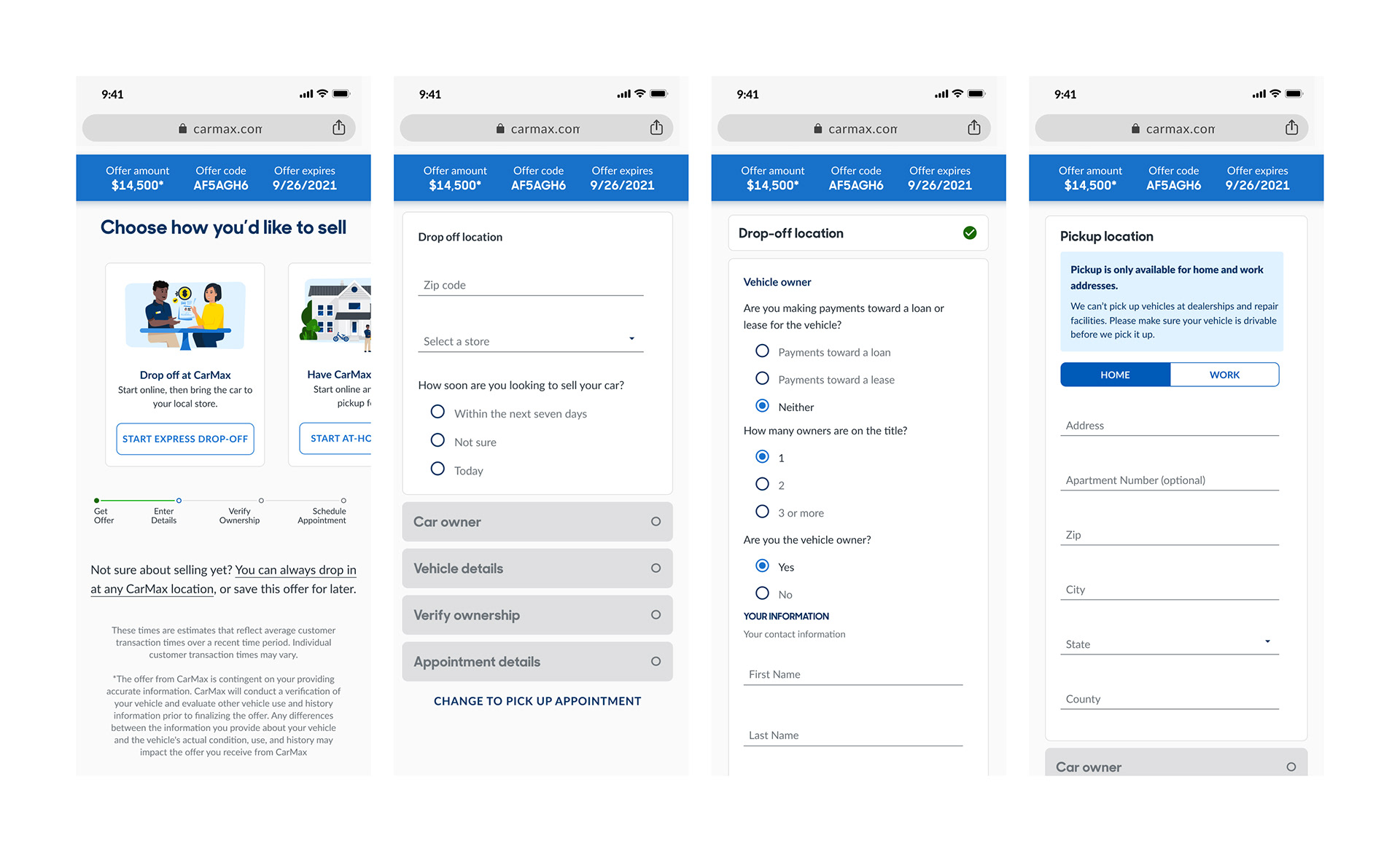
The existing appraisal checkout flow was outdated — both technically and visually.
Since its original launch:
• Our technical capabilities had increased significantly
• Our customer data and behavioral insights had deepened
• Our design language had matured
• Consumer testing had identified this flow as a tightening bottleneck
What was once sufficient had become negative friction. Customer research consistently flagged the experience as overly complex and unnecessarily lengthy. Drop-off risk was increasing at the exact moment where confidence and clarity should have been highest. The gap between our current capabilities and this legacy flow was clear, this was a major opportunity.
Before
The Approach: Modernize and Integrate
My approach had two simultaneous priorities:
• Revitalize an outdated, overly complex portion of the customer journey
• Seamlessly integrate the redesigned experience into the broader ecosystem
This was not just a redesign. It required thoughtful orchestration.
At a strategic level, I evaluated the entire journey from a 30,000-foot view — identifying friction, redundancy, and missed personalization opportunities. At a tactical level, I refined flow logic, visual hierarchy, accessibility considerations, and micro-interactions to ensure clarity at every step.
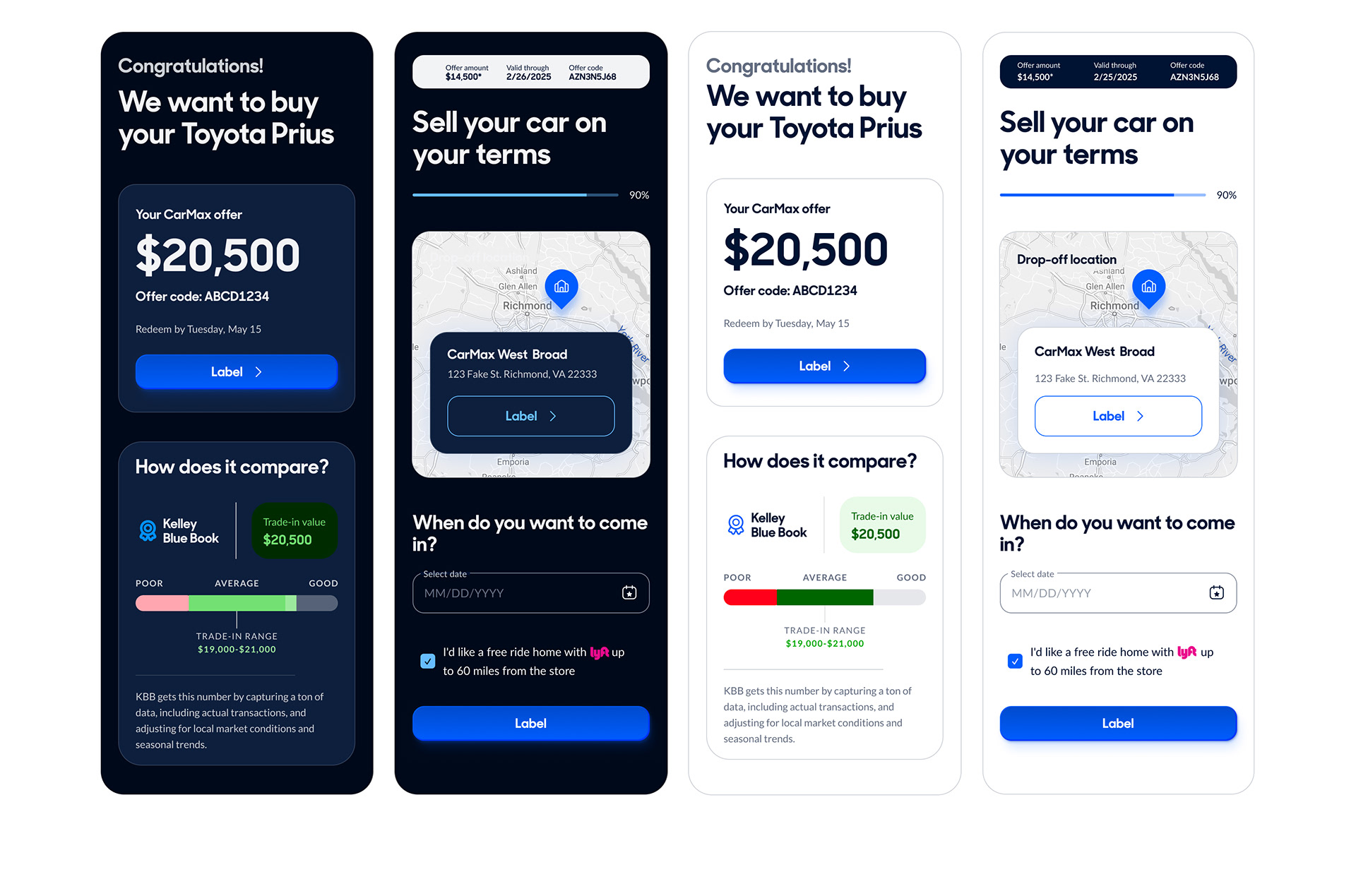
The goal was simple: Make the transaction feel inevitable — not effortful. The redesigned appraisal checkout 2.0 flow felt like a natural continuation of the customer experience, not a handoff to a disconnected system. All in all, we had cut down the flow from 17+ questions the customer had to answer to progress, to no more than 8.
My approach had two simultaneous priorities:
• Revitalize an outdated, overly complex portion of the customer journey
• Seamlessly integrate the redesigned experience into the broader ecosystem
This was not just a redesign. It required thoughtful orchestration.
At a strategic level, I evaluated the entire journey from a 30,000-foot view — identifying friction, redundancy, and missed personalization opportunities. At a tactical level, I refined flow logic, visual hierarchy, accessibility considerations, and micro-interactions to ensure clarity at every step.
The goal was simple: Make the transaction feel inevitable — not effortful. The redesigned appraisal checkout 2.0 flow felt like a natural continuation of the customer experience, not a handoff to a disconnected system. All in all, we had cut down the flow from 17+ questions the customer had to answer to progress, to no more than 8.
After
Impact: Measurable Business Acceleration
Upon nationwide launch to 100% of customers, the results were significant:
• Double-digit increase in click-through rate
• Meaningful rise in customer satisfaction
• Record-high trade-in conversions
Upon nationwide launch to 100% of customers, the results were significant:
• Double-digit increase in click-through rate
• Meaningful rise in customer satisfaction
• Record-high trade-in conversions
We also saw a dramatic increase in mid-funnel customer driven buys, which were directly attributed to the effectiveness of the new flow. It was clear, the experience removed friction at a critical inflection point in the journey. By modernizing this flow, we didn’t just improve usability — we had strengthened a core revenue engine.
My Role: Creative Leadership and Execution
I served as the Creative Lead for this initiative, partnering cross-functionally to drive the vision and implementation from ideation and strategy through to execution.
My responsibilities included:
• Creative direction and visual design
• Content creation and refinement
• Design systems alignment and adherence
• Accessibility (A11y) inclusion
• Flow logic refinement and iterative problem solving
• Prototyping and stakeholder presentations
• Art direction and experience cohesion
• Team communication and alignment
Cross-Functional Team:
• Senior Manager — Strategic oversight
• Product Designer — Template building, testing, production design
• Copywriter — Content refinement
• Strategist — Competitive analysis and directional guidance
• Project Management — Timeline planning and coordination
• Development Team — Engineering, QA, and ecosystem integration
This was a collaborative effort executed with precision — and the results truly reflected that alignment.